Infographics
An infographic is a form of information in a graphic format designed to make the data easily understandable at a glance. People use infographics to quickly communicate a message, to make the presentation of large amounts of data, to see data patterns and relationships, Infographics are used on a everyday basis by people all over the world. Infographics are in almost any public environment, examples include: traffic signs, subway maps and weather charts.The term infographics originated from Information+Graphics, in French infographie = Informatique+Graphique. In Italy the first occurrence dates back to June 6th 1991 (translated from French) in a piece about Communication Theory by Roberto Escobar. Infographics are used by all levels of management for high-level views of data. Infographics include bar graphs, pie charts, histograms, line charts, tree diagrams and mind maps. Infographics predate writing as a means of presenting information but cave drawings are probably the earliest known unofficial example. People were also creating and using maps before the invention of written language.
sources:

infographic #1 shows the difference between healthy eating and unhealthy eating and the effects the two cause on your body
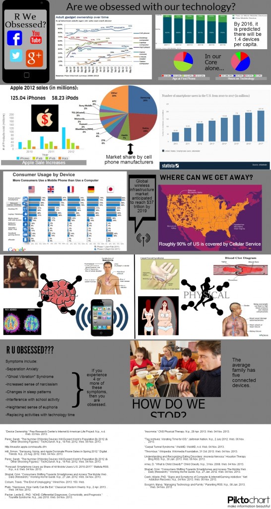
infographic #2 shows data and stats that can prove if you are or are not addicted to technology. It shows how to stop you addiction, where you can get away from your addiction and how it effects the body.
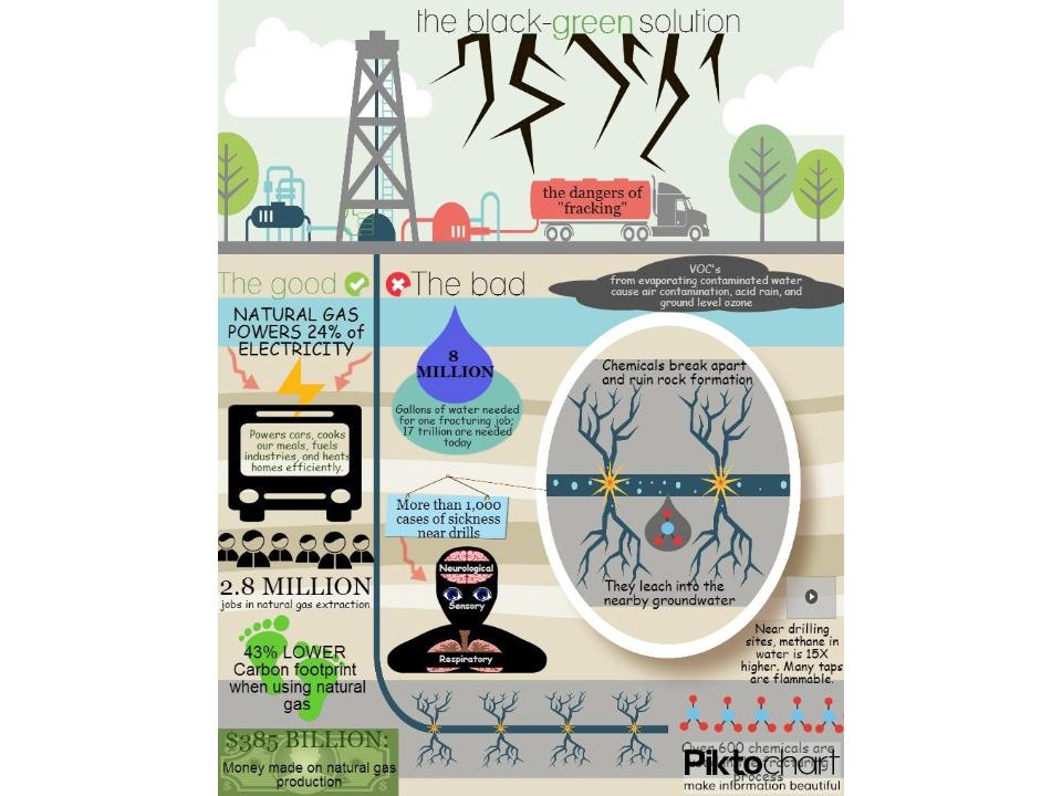
infographic #3 shows the good and bad of natural gas production and all that comes with it like money profited, work related illnesses caused and how electricity is effected.

infographic #4 is shows and explains what Dyscalculia is, who it effects and how it hurts the student.

inforgraphic #5 shows the total waste an average household disposes of per week.

inforgraphic #6 shows the average tipping rates and percentages.

inforgraphic #7 shows what is in ice cream and everything about it.
http://thumbnails.visually.netdna-cdn.com/whats-in-that-ice-cream_502919539a3f0_w580.jpg

infographic #8 shows the water cycle and step by step explainations on what happens to the water.
https://encrypted-tbn0.gstatic.com/images?q=tbn:ANd9GcSFXlYrMK8AF46URD02GCm8FkZpjASj6ow2FF40dHY0weQaHDB8Ow
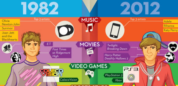
infographic #9 shows the difference in teenagers over the years. it shows the difference in music, movies, and video games.
http://www.madtomatoe.com/wp-content/uploads/2012/05/kids-1982-vs-2012-infographic1.jpg
 infographic #10 shows the cost of rasing kids and a quick overlook on how expensive it can get.
http://blogquizzlecom.c.presscdn.com/wp-content/uploads/2013/07/costofraisingkidssm.jpg
inforgraphic #7 shows what is in ice cream and everything about it.
http://thumbnails.visually.netdna-cdn.com/whats-in-that-ice-cream_502919539a3f0_w580.jpg
infographic #8 shows the water cycle and step by step explainations on what happens to the water.
https://encrypted-tbn0.gstatic.com/images?q=tbn:ANd9GcSFXlYrMK8AF46URD02GCm8FkZpjASj6ow2FF40dHY0weQaHDB8Ow
infographic #9 shows the difference in teenagers over the years. it shows the difference in music, movies, and video games.
http://www.madtomatoe.com/wp-content/uploads/2012/05/kids-1982-vs-2012-infographic1.jpg
http://blogquizzlecom.c.presscdn.com/wp-content/uploads/2013/07/costofraisingkidssm.jpg
No comments:
Post a Comment